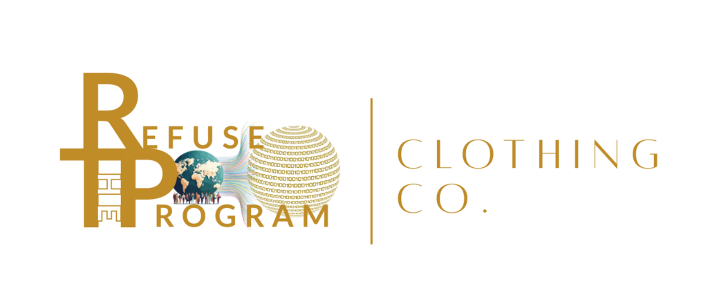
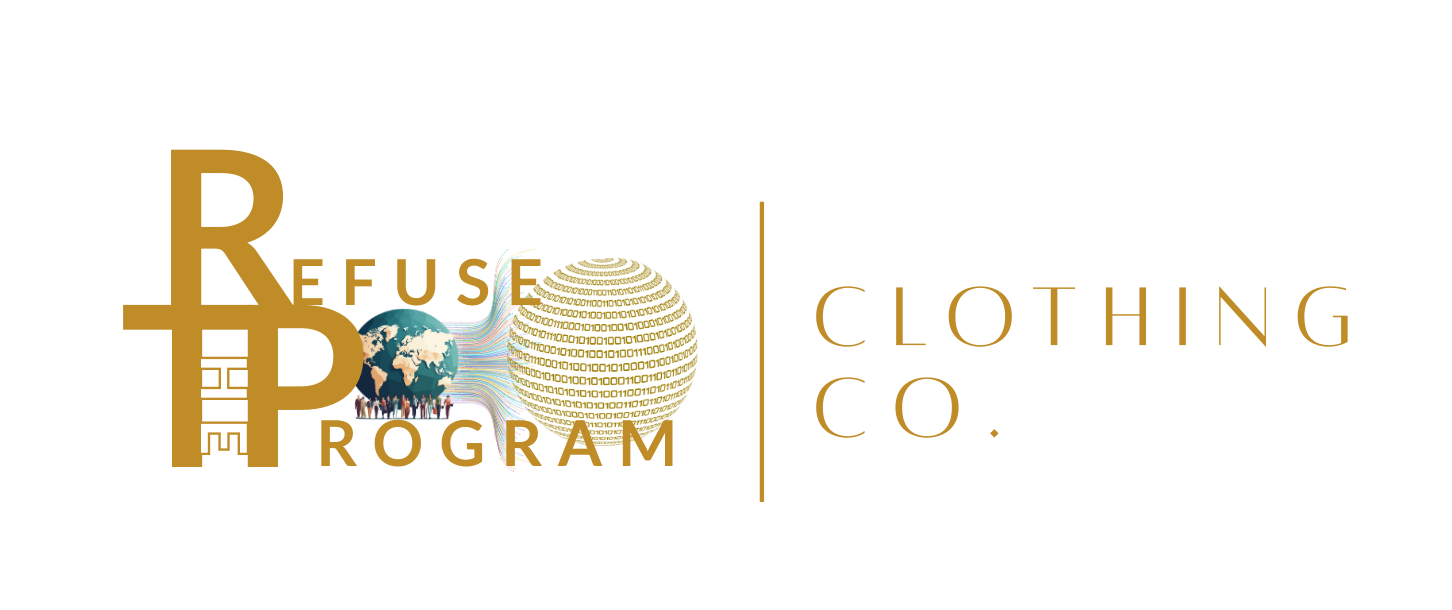


The Refuse the Program logo primarily was supposed to show a message of unity and strength of the people. The design came and was intended to show that together the people could shield the world from the “program.” We came up with a unique arrangement of the words to feature an integration of each first letter of the phrase.
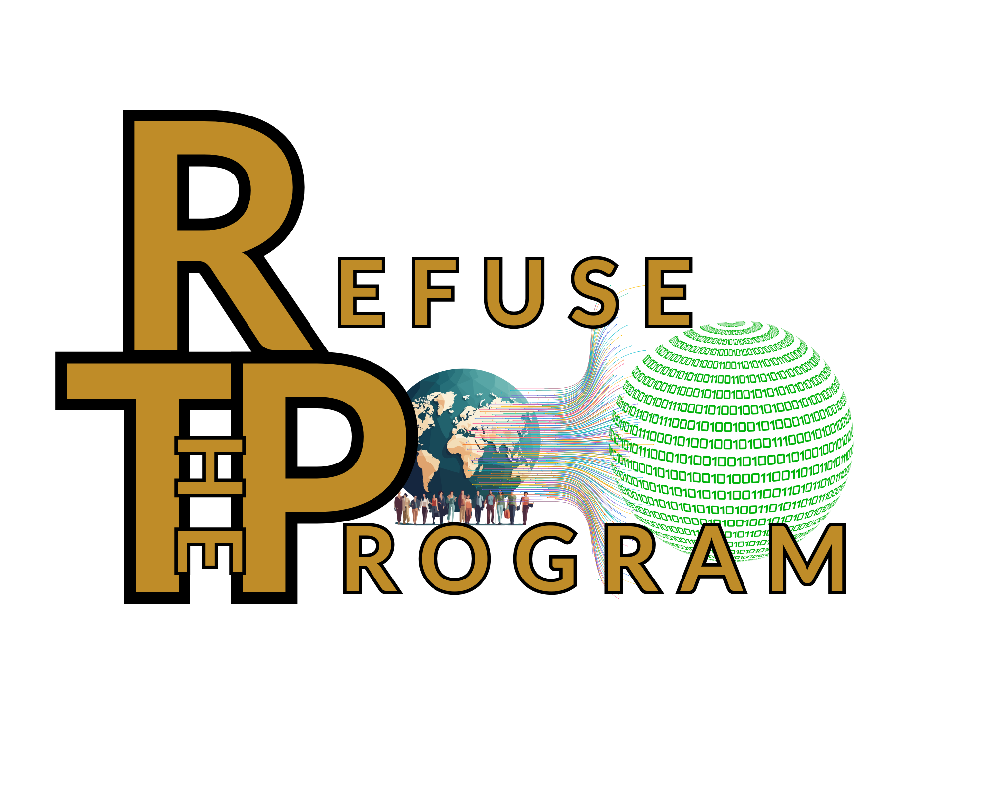
In between Refuse and Program we included a realistic representation of the planet Earth with a set of people that represent multiple races working in unity to generate a barrier that is keeping the “Matrix” that is attempting to mimic the design from being able to absorb the planet. This design shows integration of multiple people and beliefs working together to achieve the protection of the planet from being stolen or absorbed into the illusion being propagated.
This style is considered the “original” logo and holds meaning to what our movement symbolizes. This prevents the tactics to misconstrue or damage the credibility of our movement in the future as tends to happen whenever a group or movement begins to gain traction. This movement is not simply a “brand” or commercial venture, while this is a required implementation in order to be able to form any foundation. Once more of a foundation and recognition is gained, then we can move for a more structured approach that can be focused more on education and recognition of the reality that has been hidden through misconstruction and disillusioning the public through false information or half-truths which is how most media outlets tend to operate using people’s gullibility to trust them as the sword that strikes when one’s head is turned.
The “RTP” Logo Style
Another more simplified styling which is known as the RTP Logo features a uniquely formed interlock of the R, T and P letters and has Refuse The Program placed in a special ratio at the top, center, and base of the interlocking RTP symbol that is shown which creates an ancient glyph for healing and wisdom thorough the logo design.
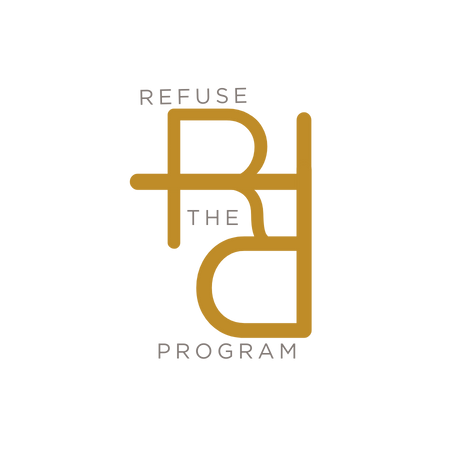
This design is very minimalist and looks unique and stylish when placed and marked on our clothing and other accessories. The simple design is unique and clearly states your stance and support for the Refuse the Program movement. Typically seen in either Signature Gold or Black/White it is a modern design and less bold, yet still concise expression of you being a supporter of nature and our reality that can be free of all of the instigated problems that have been provided to us as we have grown and accepted their “program” as our reality.
Leave a Reply